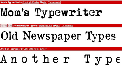
 After researching different typography we decided a typewriter effect would work well with our piece as the phone call to 999 is formatted in a similar fashion therefore we wanted to follow the conventions of an emergency. The font above is AMERICAN TYPEWRITER.
Founded on the Macs via Imovie it was simply understood and followed the conventions we found in 50 Cent's music video "In da Club" and The Matrix.

We used dafont.com at the beginning of our research but soon found that every font in the 'Typerwriter' catergory looked very similar. The only difference that made them stand apart were:
- distortion
- colour
- boldness
- gaps/closeness between letters
No comments:
Post a Comment